Reading has many incredible benefits, but only 32% of 16-24-year-olds regularly read, making them the age group who read the least. There’s a variety of reasons for this, but social media is a key contributor, eating up free time and shortening attention spans.
Experimenting with the experience of reading
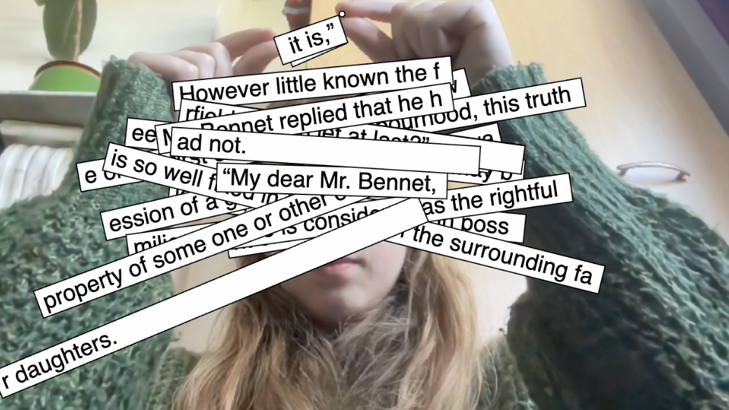
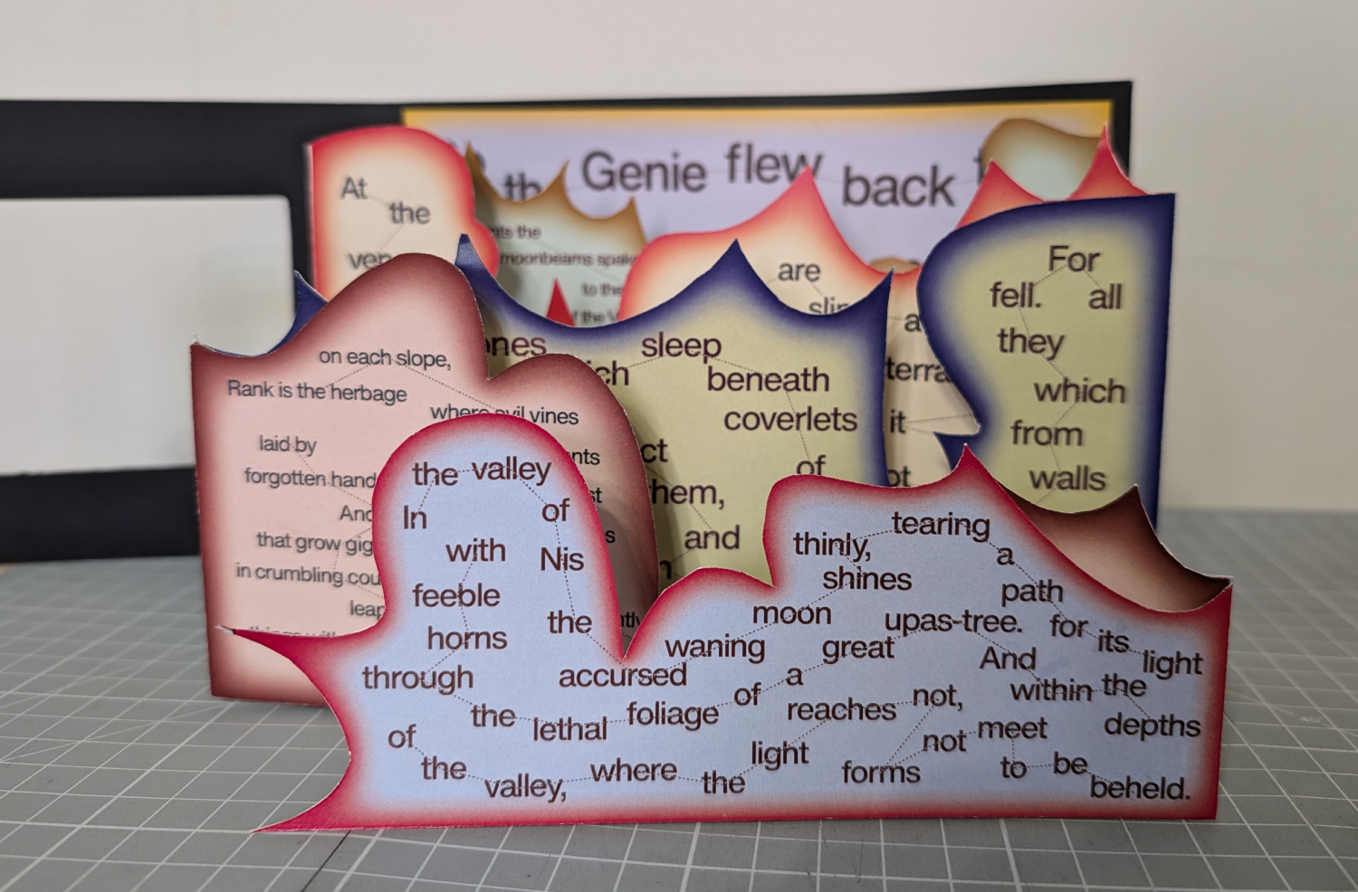
I experimented with p5.js & ml5.js, print, and adding gamification and social features to reading
Insights and goals
I then dived deeper into the issue, specifically what makes social media feel so easy and addictive. I aimed to leverage these strategies to make reading feel the same.
User personas
I also created six user personas based on real statistics to have a better understanding of my audience.
Route 1
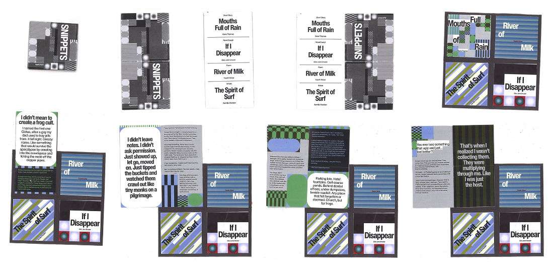
A subscription service that sends users a small, portable printed publication filled with short reading content tailored to their interests.
Route 2
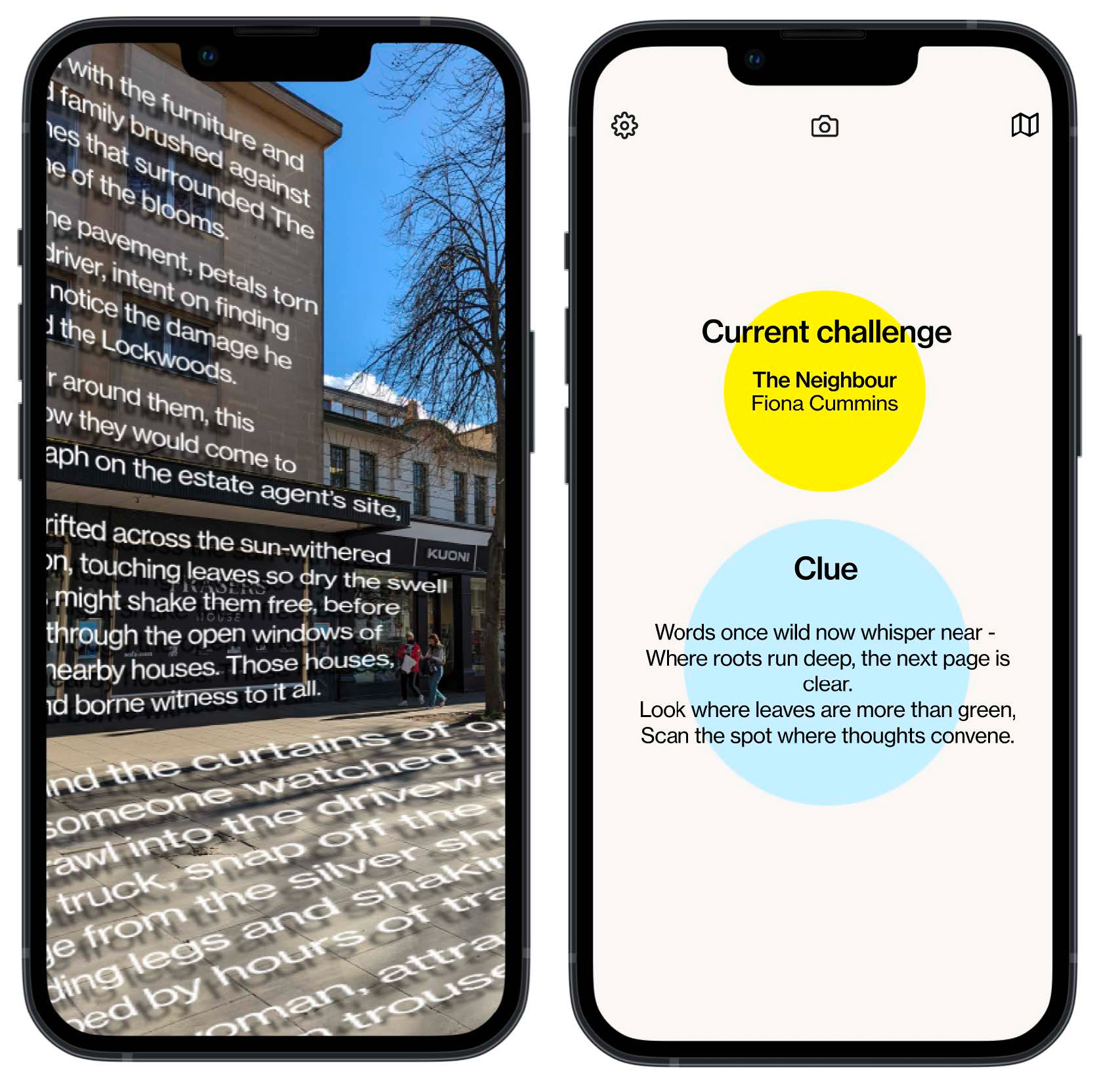
An AR treasure hunt where users follow clues to find the next part of a specially written story in their local area.
Route 3
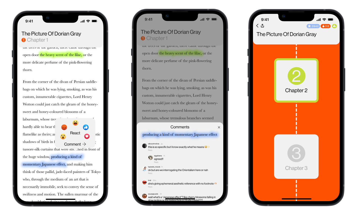
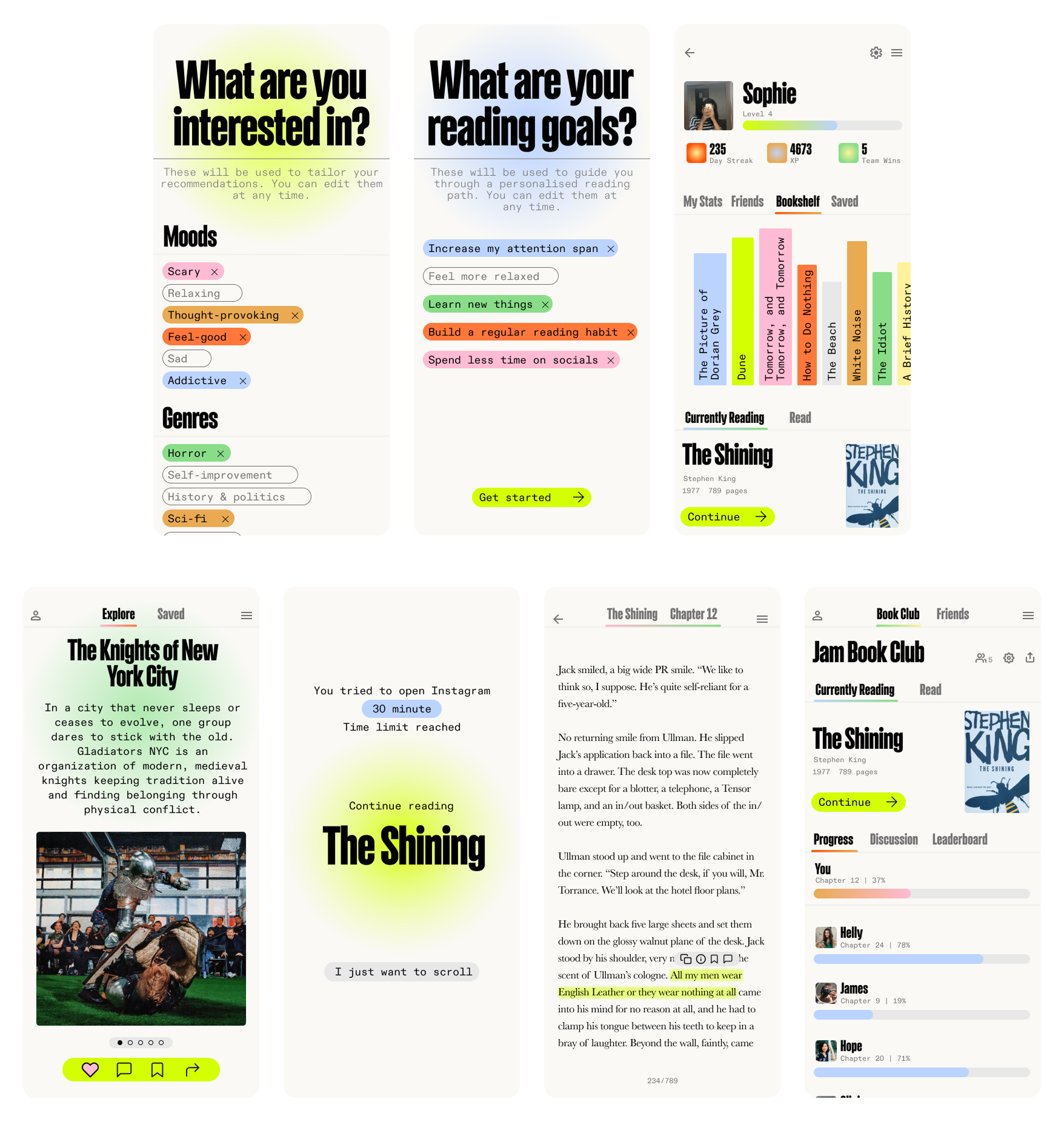
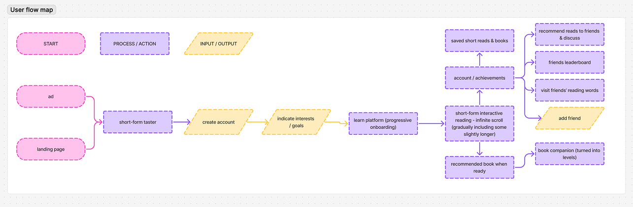
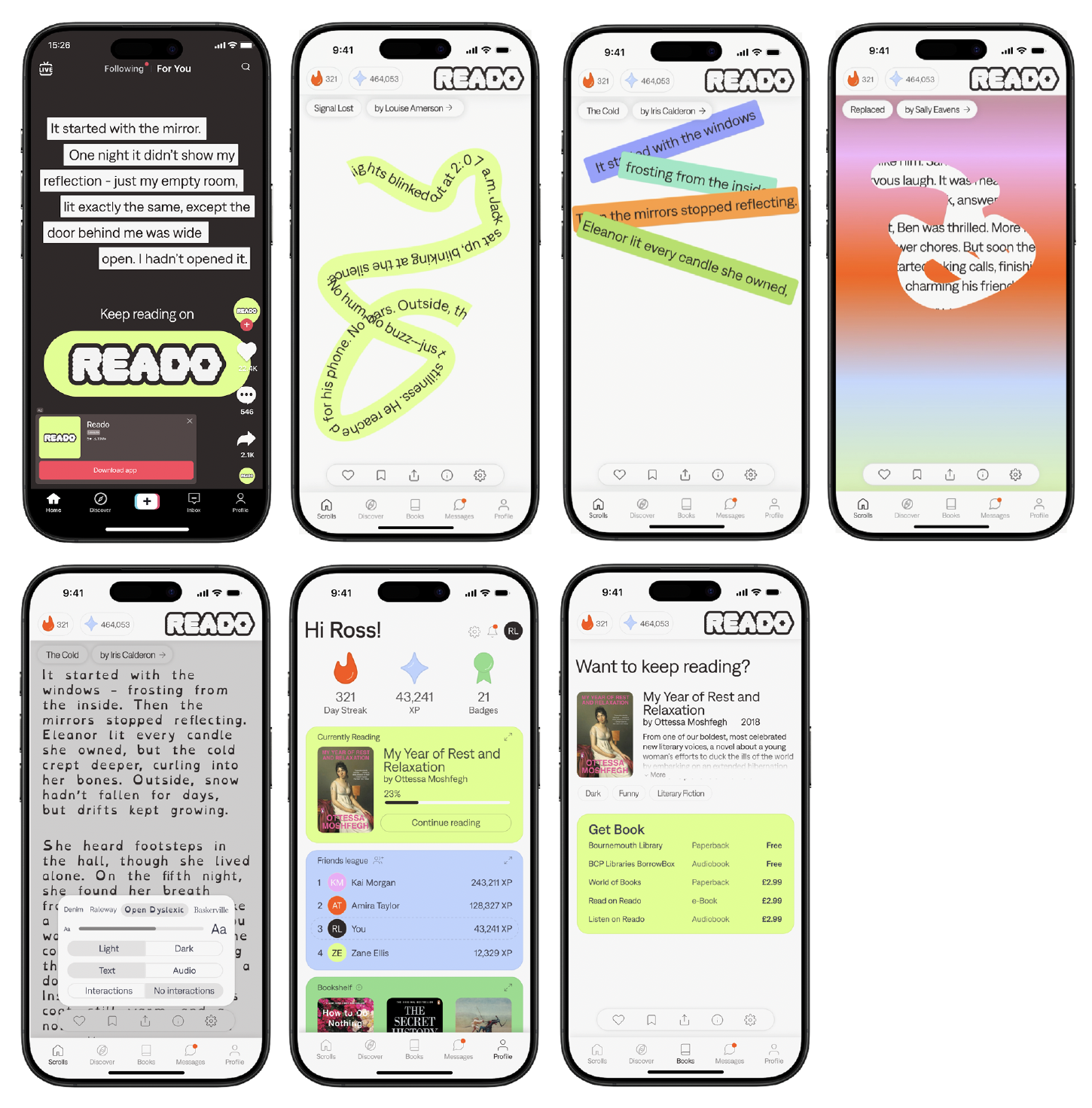
A social reading app where users could scroll through recommended short fiction and non-fiction based on an algorithm and comment, similar to TikTok and Instagram Reels. They could also join bookclubs with their friends and read books together, read on the app, and leave comments for their friends to see. There is also a social media blocker feature that prevents users going on social media once they have reached there daily limit, and directs them to scrolling through reading content instead.
I chose to move Route 3 because it aligns with users’ existing behaviours rather than asking users to adopt entirely new ones.
Developing and refining
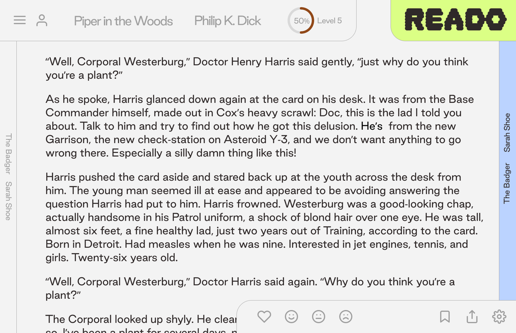
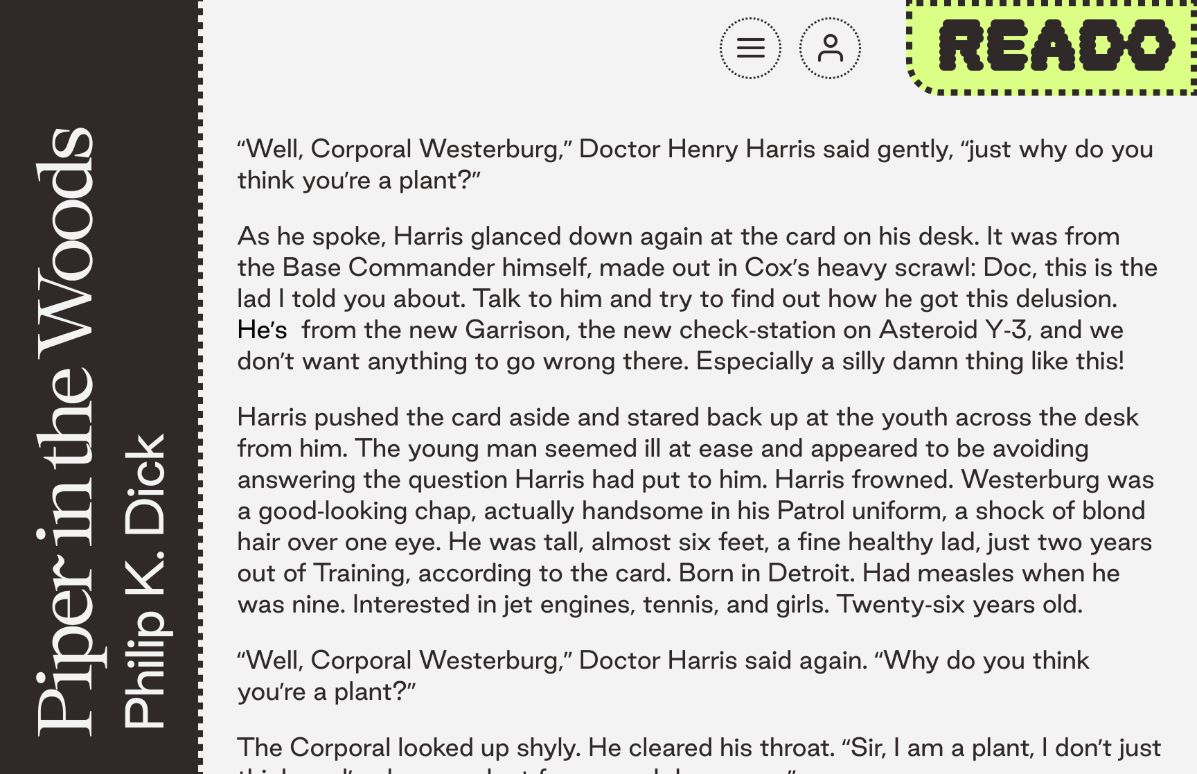
I first experimented with a web version, before settling on an app.